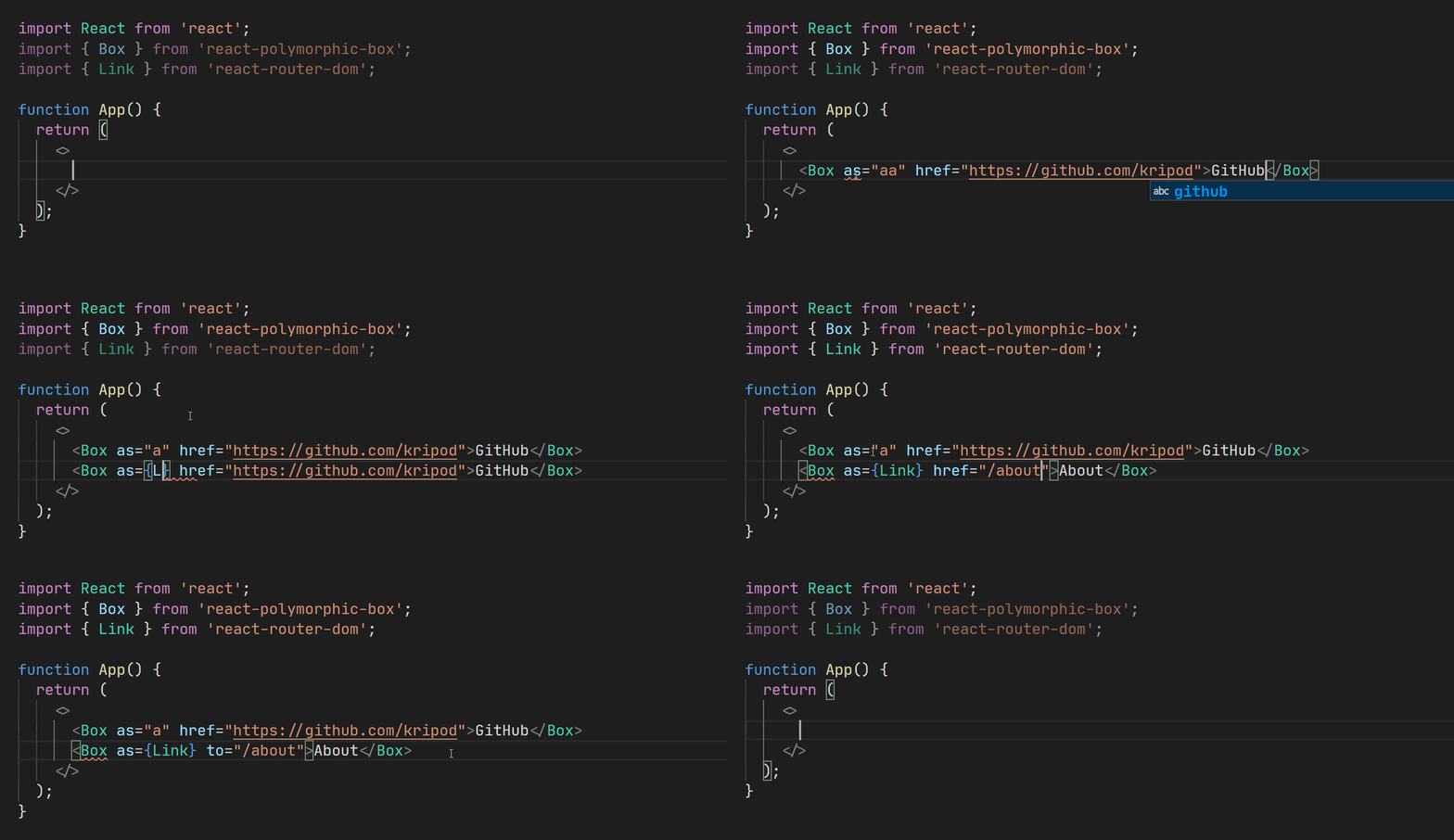
Building blocks for strongly typed polymorphic components in React.
Popularized by Styled Components v4, the as prop allows changing the HTML tag rendered by a component, e.g.:
import { Box } from 'react-polymorphic-box';
import { Link } from 'react-router-dom';

<Box as="a" href="https://github.com/kripod">GitHub</Box>
<Box as={Link} to="/about">About</Box>
While this pattern has been encouraged by several libraries, typings had lacked support for polymorphism, missing benefits like:
- Automatic code completion, based on the value of the
asprop - Static type checking against the associated component's inferred props
- HTML element name validation
A Heading component can demonstrate the effectiveness of polymorphism:
<Heading color="rebeccapurple">Heading</Heading>
<Heading as="h3">Subheading</Heading>
Custom components like the previous one may utilize the package as shown below.
import { Box, PolymorphicComponentProps } from "react-polymorphic-box";

// Component-specific props should be specified separately
export type HeadingOwnProps = {
  color?: string;
};

// Merge own props with others inherited from the underlying element type
export type HeadingProps<
  E extends React.ElementType
> = PolymorphicComponentProps<E, HeadingOwnProps>;

// An HTML tag or a different React component can be rendered by default
const defaultElement = "h2";

export function Heading<E extends React.ElementType = typeof defaultElement>({
  color,
  style,
  ...restProps
}: HeadingProps<E>): JSX.Element {
  // The `as` prop may be overridden by the passed props
  return <Box as={defaultElement} style={{ color, ...style }} {...restProps} />;
}Alternatively, you can also type your custom components by using the PolymorphicComponent type. This is especially handy when working with external libraries that already expose polymorphic components. Here's an example implementing the Heading component from above using styled-components:
import { PolymorphicComponent } from "react-polymorphic-box";
import styled from "styled-components";

// Component-specific props
export type HeadingProps = {
  color?: string;
};

// An HTML tag or a different React component can be rendered by default
const defaultElement = "h2";

export const Heading: PolymorphicComponent<
  HeadingProps, // Merged with props from the underlying element type
  typeof defaultElement // Default element type (optional, defaults to 'div')
> = styled(defaultElement)<HeadingProps>`
  color: ${(props) => props.color};
`;Library authors should consider encapsulating reusable components, passing a ref through each of them:
import { Box } from "react-polymorphic-box";

export const Heading: <E extends React.ElementType = typeof defaultElement>(
  props: HeadingProps<E>
) => React.ReactElement | null = React.forwardRef(
  <E extends React.ElementType = typeof defaultElement>(
    { color, style, ...restProps }: HeadingProps<E>,
    ref: typeof restProps.ref
  ) => {
    return (
      <Box
        as={defaultElement}
        ref={ref}
        style={{ color, ...style }}
        {...restProps}
      />
    );
  }
);
The component can then receive a ref prop (live demo), just like a regular HTML element:
import { useRef } from "react";

function App() {
  const ref = useRef<HTMLHeadingElement>(null);
  return <Heading ref={ref}>It works!</Heading>;
}


